← Back
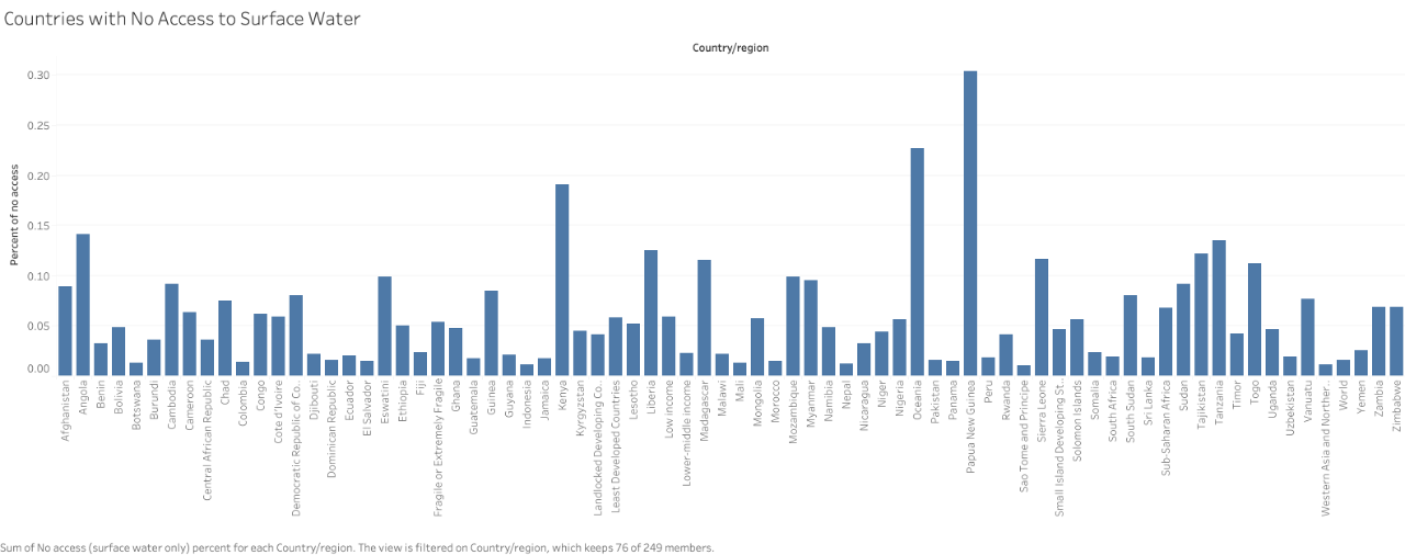
First Graph
Final Chart:
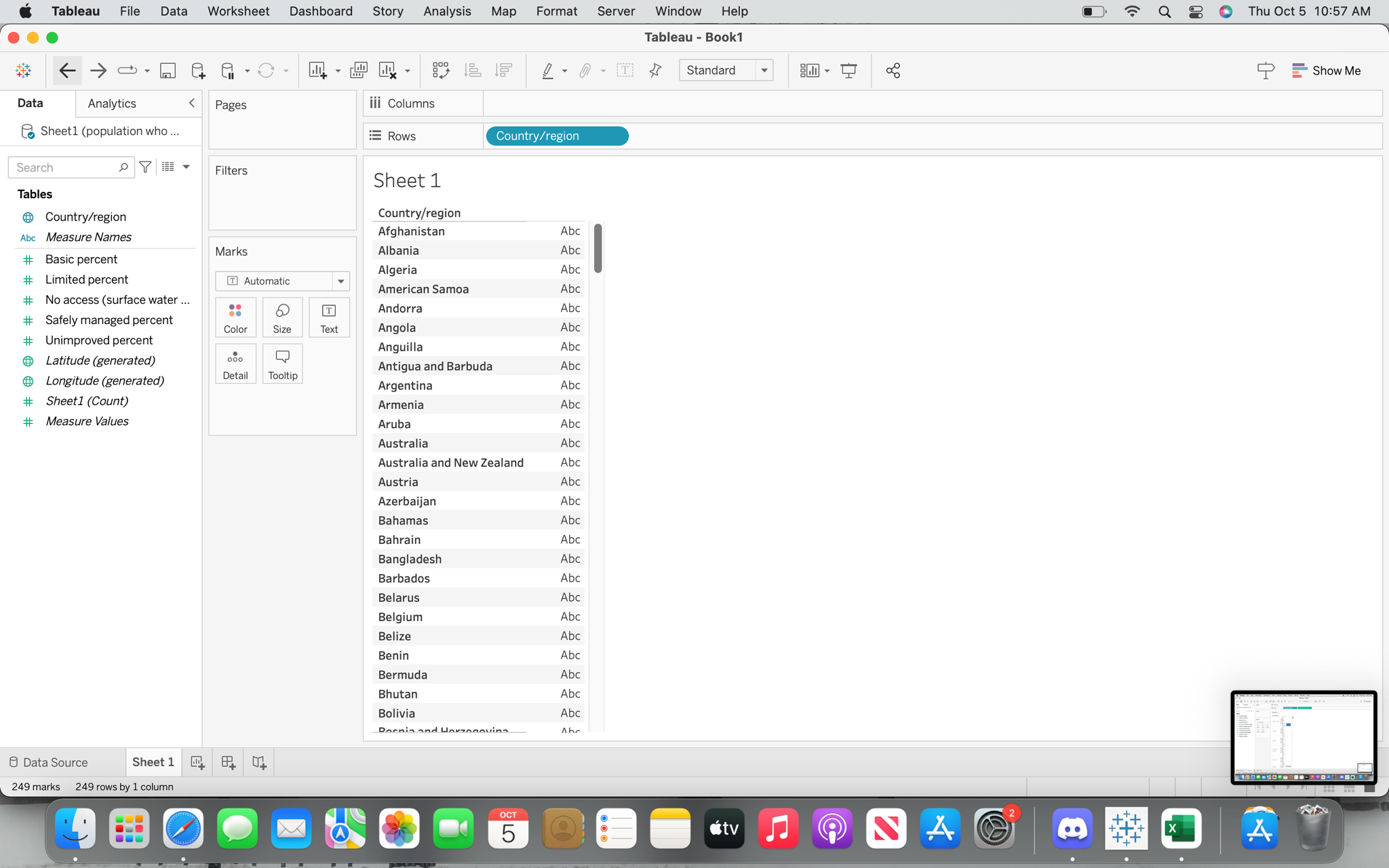
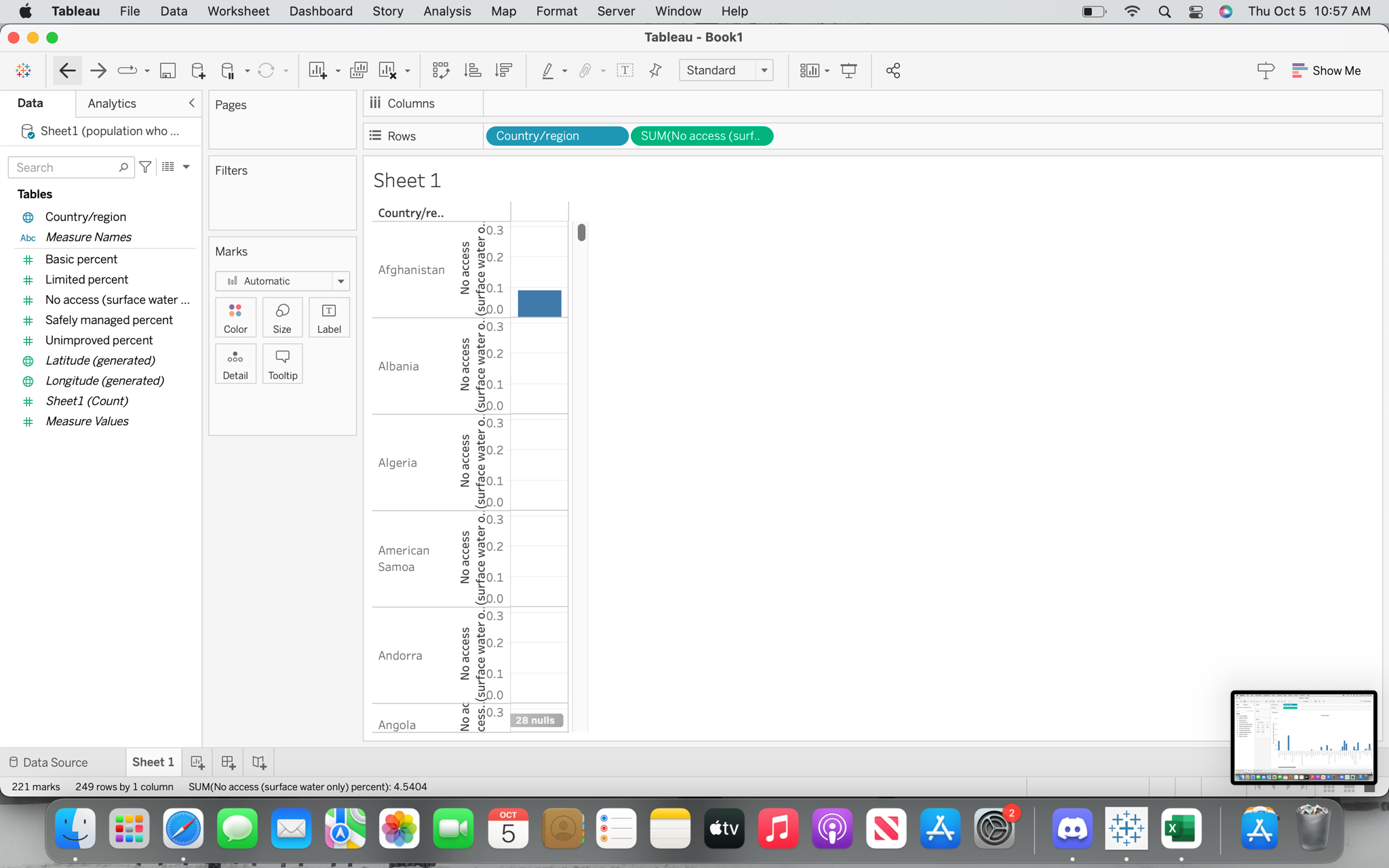
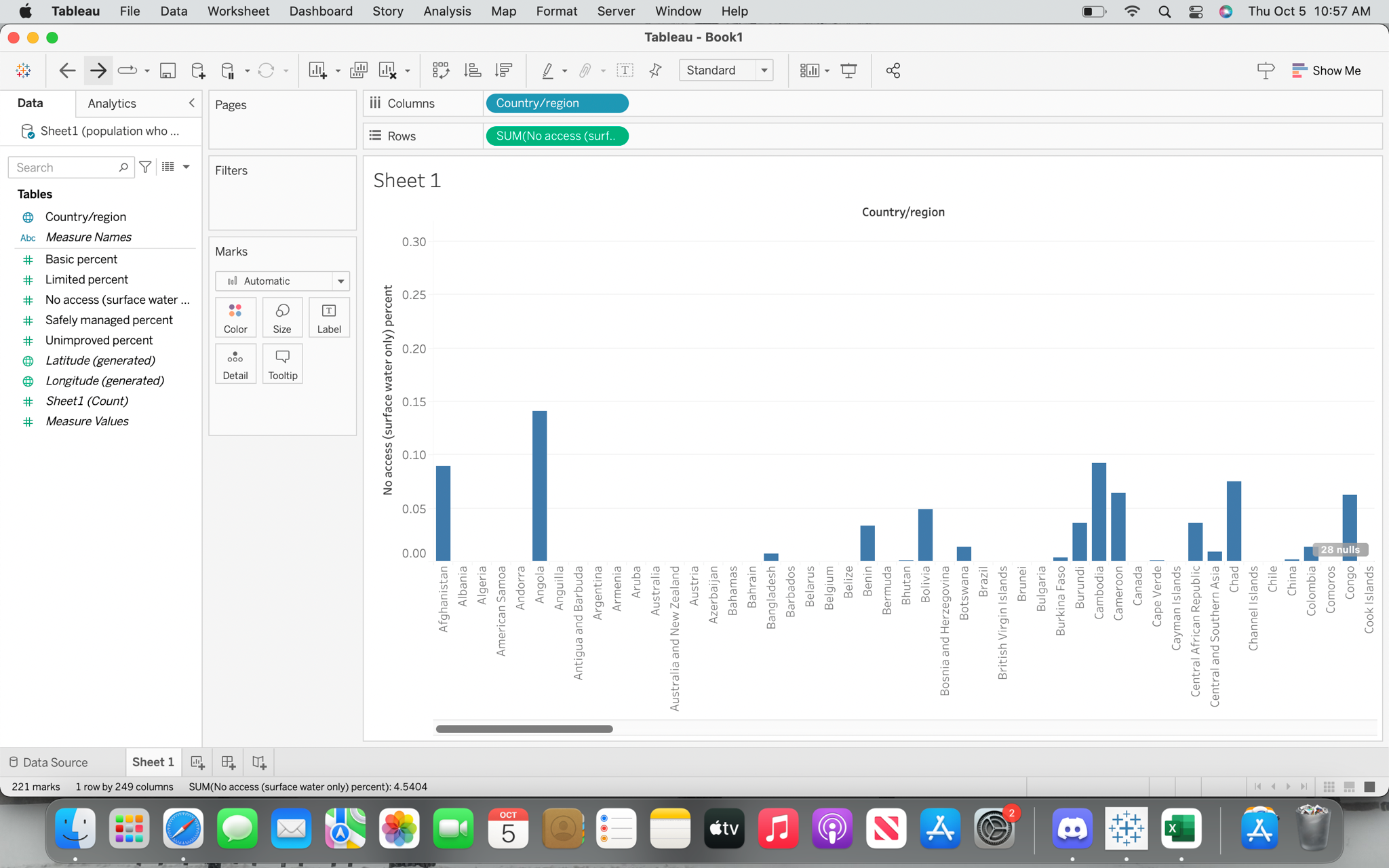
The Process:
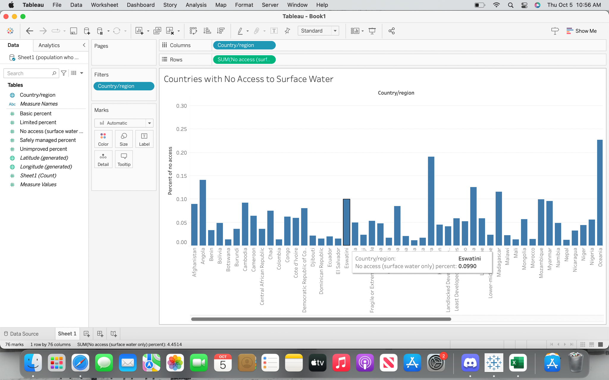
This data set covered a lot of information about water access, but I chose to focus on the percent with no access to surface water. I used the filter feature to make it so the graph only showed countries that had a percent of >= 0.01 in order to filter out the countries with 0%.
This answers the questions: What country has the highest percentage of no access to surface water? What countries don't appear that are surprising? What region are the countries in?
Post a comment